As a CFO, how are your chart-designing skills? Good? Bad? Or, as my old boss Jeff Rumbaugh used to say/ask, “Butt ugly?”
Studying good chart design is one thing. Putting great chart design into practice is another. Let’s get started with an example.
An Ugly Chart
Recently, a CEO friend sent me a PowerPoint file he received while at a business conference. The slides included many tables and several charts. There’s one that particularly stuck out that I found hard to read:
Tufte might say, “Too much chart junk.”
How about the use of cumulative run charts? While sexy, they are not easy to decipher. I periodically use cumulative run charts for reader shock value, but I think we can do much better than the above.
Step One – Data Preparation
When I work with young data analysts, data prepping is where I see the biggest weaknesses.
Even a small eCommerce CFO was still trying to put monthly sales data into separate worksheets before I started helping him. Previously, he never understood how to collect and manage data efficiently and effectively.
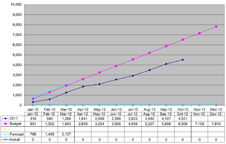
Our case study is easy. We’re just tracking actual and budget data across 12 months.
You can see the rows for Actual, Budget, and Variance. Notice the following:
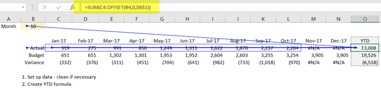
- I’ve added a placeholder for month so that I can use that variable for YTD calculations
- While there are 2-3 ways to skin this cat, I used the sum/offset combination for calculating YTD totals
- I liberally use #N/A so that my charts will read those empty cells as null values instead of a number (as in zero)
Like all steps, keep it simple.
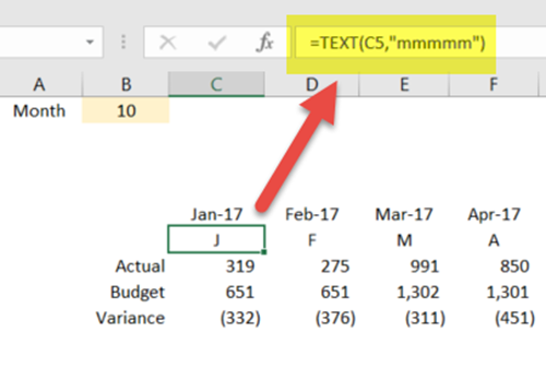
Step Two – Chart Labels Preparation
I’m anal when it comes to x- and y-axis labels. Plus, I can’t stand angled text. Accordingly, I’ve created an extra row below to show how I want my monthly headings formatted:
I find this step a bit exhausting in Excel–options should exist to abbreviate dates. If you use Tableau, you know exactly what I mean. Still, I’m a professional, and I want my clients to see professionally-produced visuals. Thus, I’m rolling with this step.
Step 3 – Drawing the Chart
Finally, the good stuff.
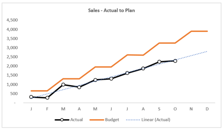
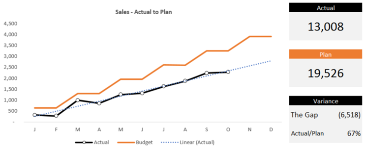
Here’s what my version of the truth looks like:
Let’s talk shop. Below are some of the changes I made to Excel’s suggested chart:
- I removed the grid lines – no benefit
- I added a clear title while minimizing the font
- I sized the chart roughly to where the width is about 2 times wider than the height
I normally do not include trend lines as our CEOs do not understand them. In this case, I made an exception.
This company trails the budget every single month. Since the actual trend is linear, I wanted to show that the future is not positive.
I did not add a forecast to this visual. In the appendix below, I show you one method for incorporating forecasted data.
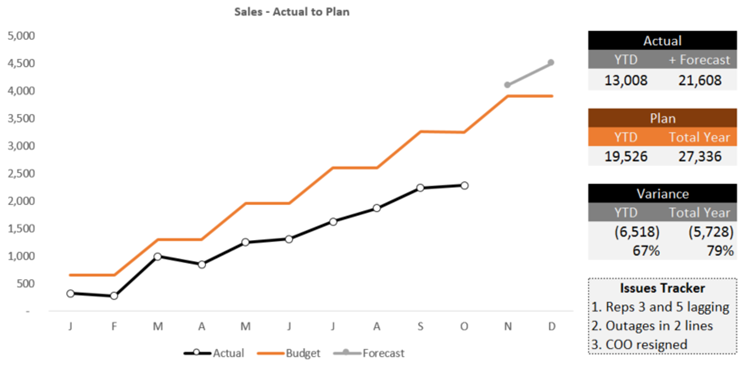
Step Four – The Small Dashboard
We have a nice chart. But we’re missing some vital information. While we see the monthly trends, how are we doing for the year?
Accordingly, I’ve added a few block elements that give us that information quickly:
Are you a data-centric person? Don’t worry; the data driving the visual above is included in the Excel workbook directly below the simple dashboard.
Before we move on, let me make it clear that I’m not a dashboard designer.
Accordingly, the dashboards I create for clients are simple, topical, and actionable. My Steve-Krug-Don’t-Make-Me-Think rule is simple. If the client CEO cannot understand the message from the dashboard in a few seconds, we pitch it and start over.
Step Five – Take Action
This is my favorite step, acting on the information.
Remember our old W-2 days where we’d sit around in a conference room mulling over some data with other managers in a Dilbert-like fashion? After the meeting, we’d all go our different ways without taking any action. Not anymore. Those days are long gone, especially since we can help to create change in the organizations we serve.
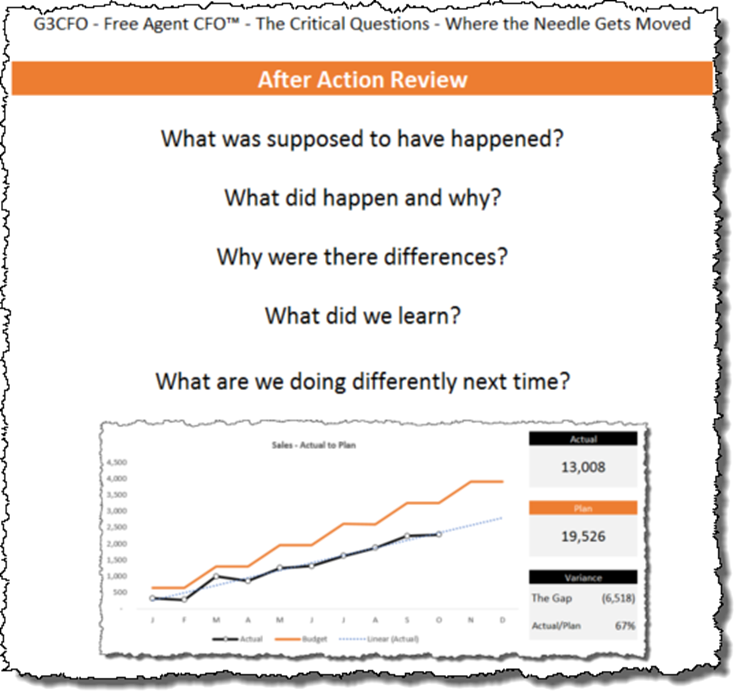
Since reading Gordon Sullivan’s Hope is not a Method (every CEO should read this book), I’ve become a big fan of After-Action Reviews.
Most of my Excel workbooks now include 4-5 After Action Review questions like the following:
- What was supposed to have happened?
- What did happen and why?
- Why were there differences?
- What did we learn?
- What are we doing differently next time?
Never go past a reporting cycle of any kind without answering these questions (in your own words). Beautiful dashboards are meaningless without purposeful action. This mental model gets the job done.
Appendix – Bullet Charts – Well, Almost
Bullet charts are not easy to build in Excel. I don’t care what the experts say; there’s no 3-second process for building these like we can in Tableau.
Just in case, feel free to create something like the chart below. I could have easily swapped the visual below for the block of data in my original dashboard. I just did not like the result:
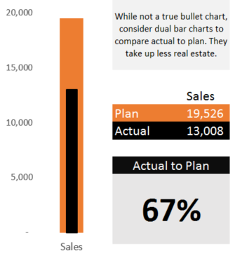
Technically, the above is not a bullet chart as I only have two data points–budget and actual.
I still like the bar within a bar chart as it takes up minimal real estate. You can easily turn these on their sides too.
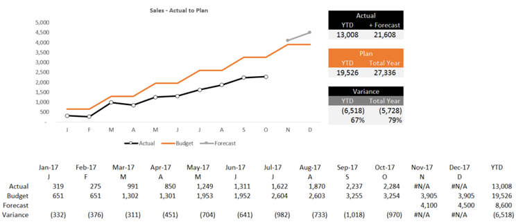
Appendix – Adding the Forecast
Many of you may be chastising me for leaving out the forecast. Why not just adjust the budget? Or does that require an act of Congress?
Since you asked for it, here’s what my version looks like. All I did was add a row under budget; then, I added the element in the chart.
If we add the forecast line, we need to modify the blocks of content to the right of the chart. Here’s what I did:
Additional Reading
Over the past few years, my net worth has taken a huge hit–I own every Stephen Few book (more like college textbooks). Few has slowed down his writing pace, but his blog over at Perceptual Edge is excellent–one that I recommend regularly.
Thanks to Jeff R., mentioned at the outset, the first book I purchased on good chart design was Tufte’s The Visual Display of Quantitative Information. It’s heavy on theory, but I pull it out periodically.
I own dozens of other books on chart design, but my favorite right now is The Big Book of Dashboards by Andy Cotgreave, Steve Wexler, and Jeffrey Shaffer. The hard-to-put-down book is practical.
Here are a few other books that are high on my list and are underrated:
- Effective Data Visualization by Stephanie Evergreen. I like her blog and have implemented some of her hacks in my work (I love her technique on slope graphs).
- I peruse The Wall Street Journal Guide to Information Graphics 1-2 times yearly.
- The biggest sleeper of all is Creating More Effective Graphs by Naomi Robbins – it’s in black and white, but so what. If you buy it, get the physical copy, as it’s a nice reference to have nearby.
- Finally, there’s my hero Charley Kyd of ExcelUser. I call him the CFO’s CFO. Buy his swipe file monthly subscription if he still offers it. Read his blog. It’s outstanding.
When time permits, I scan/study Tableau visuals over at Tableau Public. I follow 10 viz publishers, along with doing periodic searches if I’m stumped on a certain design. I will not list all of them, but the Top 3 are:
- Ryan Sleeper, a nearby Kansas City resident
- Andy Kriebel – I wish I had one-tenth of his talents
- Andy Cotgreave – unlike the two above, I can come close to replicating his work – he proves that simple can be both elegant and effective
My suggestion is to pick one or two viz publishers and follow their work regularly if you want to grow in your chart-design acumen and abilities. What you learn from them will begin to stick over time. Your clients will be better off for it too.
Would You Like My Excel File?
Sorry, you’ll have to work on it. First, sign up for updates down below. Then send me a message on LinkedIn asking for the file. Give me about 1 day to share it with you.
I love this! I also love the “Don’t Make Me Think” rule.
Thanks Mark!
Adam
Thanks, Adam.
I had fun doing this one.