Good decisions, bad decisions, foolish decisions, indecision. It doesn’t matter–every CEO action finds its way to the P&L and balance sheet.
Every CFO I know is a financial reporting aficionado. But as one peer recently reminded me, seeing how other professionals create reporting for their clients is both helpful and insightful. If you concur, then buckle up, we’re going to have a little fun.
The Front Page – Keeping it Simple
I absolutely hate push-button financials. You know, the cumbrous kind with about 100 P&L line items in alphabetical order that make no sense whatsoever. No wonder the typical CEO cannot understand financial statements.
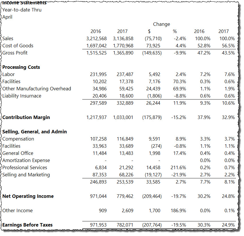
So just a friendly reminder, create what I call the 1-minute P&L where any living, breathing person can figure out if the company is winning or losing in 60 seconds or less. I know you do this but just in case, here is a simple example:
I’m not going to show every iteration of the P&L, but my clients and I can easily and quickly toggle to the following in the same workbook:
Trailing 12-month P&L
Trailing 12-month common-sized P&L (percent to revenue, units, orders, or contracts)
Detailed P&L by GL account number in every time view imaginable
In short, we start at a very high level to get the big picture. We can drill down to more detailed reporting as needed.
The Scrollable P&L
As your unofficial CFO coach, please don’t try and cram a bunch of meaningless graphs into a small space. Think website. Specifically, think homepage of your favorite website. And that’s what I do for the front page of the P&L.
I don’t do this to be cute or pretty. Quite the opposite. I’m lazy and don’t want to work hard looking for anomalies. Instead, I let a few simple pictures tell me if something is amiss.
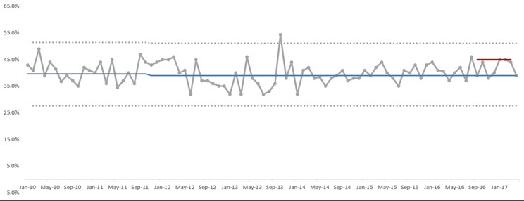
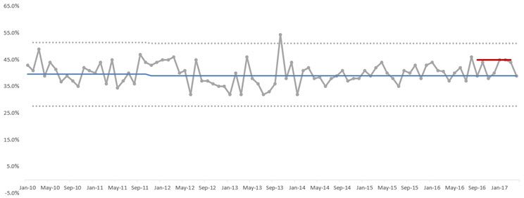
Gross Margins
Gross margins are arguably the most critical numbers to manage on the P&L. If not, pre-tax margins will be toast.
Again, I focus on images looking for anomalies. At a high level, we’re looking for signals in the noise:
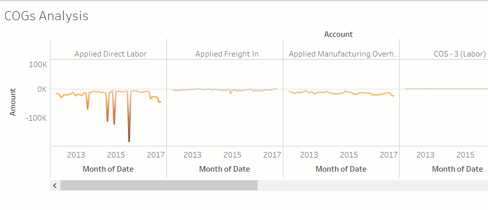
We all know that cost of goods can be confusing to CEOs, especially if there are multiple COGs accounts. Accordingly, I go the visual route again. Like I said, I don’t do graphs/charts for the sake of doing so–they have to serve a purpose. And these do the trick:
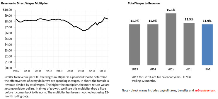
Compensation
Before heading over to the balance sheet, I like a high-level view of overall compensation. I still review on a more granular level, but I look at the big picture by scanning the wages multiplier. If you’re good with Excel, you can easily do this by department:
The revenue multiplier trend is like watching molasses drip on a Missouri winter morning or watching grass grow at St. Andrews. Accordingly, we’re looking for ugly trends (with the aide of more granular analysis when we compare plan to actual in our financial model).
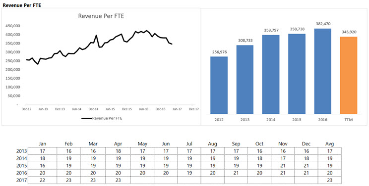
At this point, you are probably asking about Revenue per FTE. Yes, I include this too. But I only look at the numbers about once per year. Revenue per FTE defines the underlying business model. Change or shake up the business model and Revenue per FTE changes.
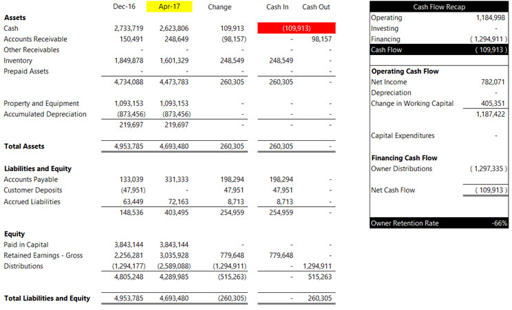
Balance Sheet Analysis
I have a confession to make. I love shortcuts. I have about 5-6 versions of the balance sheets I go over with my clients, but 90% of the time, I focus on just one, and I combine it with cash flow reporting. Take a look below:
I also include about 3 versions of cash flow reporting, but the above has been my biggest coaching tool in teaching cash flow analysis to my clients. I now have small business CEOs that can tell you what free cash flow is while big company CEOs are still stuck on EBITDA thinking it’s a proxy for cash flow–yeah, right.
Don’t underestimate the power of combining cash flow analysis with your balance sheets–it works. And if you know Excel, I’ve set up my tool where I can easily toggle the dates–you can do it too.
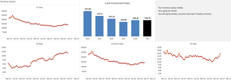
Working Capital Analysis
I’m anal on working capital analysis, and I have about 5-6 ways I present these numbers. Let’s start with cash conversion days:
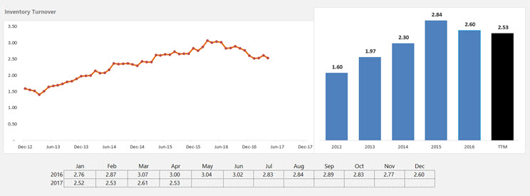
I knew you’d ask, so inventory turnover is included below:
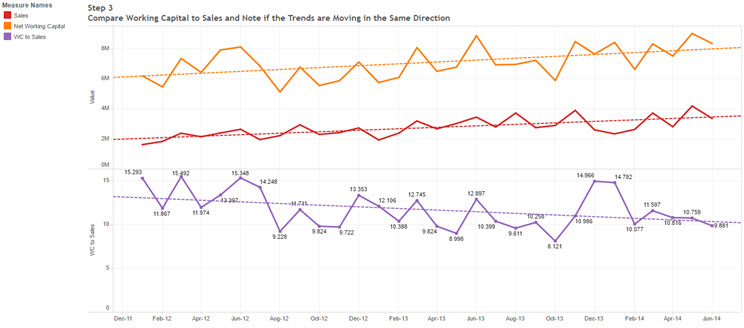
Be cautious with your turnover numbers when sales (and COGs) are growing rapidly or moving downward at a fast clip. If so, the math gets ugly. In cases like that, I stick to raw numbers like the visual below where I show sales and working capital plotted on the same graph.
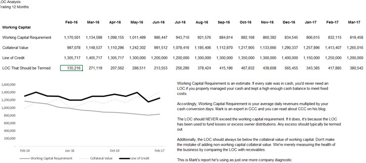
Line of Credit Analysis
I’d say about half my clients submit borrowing base certificates to their lenders. But I go a step further internally. I use automation to calculate the following:
Working capital requirement based on sales and CCC above
Collateral value using the bank’s discounts
LOC balance
Excess LOC balance (LOC less Working Capital Requirement)
Here’s what that snapshot looks like:
Wrapping Up
Most of the reporting packages I create for accounting departments sometimes have upwards to 100 sheets in an Excel workbook. That may seem like a lot, but once the workbook is created, it can be updated in about 5-10 minutes.
Here’s my workflow that I teach/train to my client accounting departments:
Complete a 3-5 day close using The Smart Close™ (a topic for another day)
CFO review of numbers on day 6 or 7
One-to-one meeting between CEO and CFO following an After Action Review format
If CFO owns banking relationship, go over numbers with banker either monthly or quarterly
If applicable, drop actuals in financial model and update forecast – go over with CEO during week 3